
US Bank Partner Card - Lost/Stolen Card Replacement
Product Designer (UX, Interaction & Visual Design) | July 2022 – December 2022
User Research, Interaction, Visual design, Prototyping & QA Testing
Applications
Mobile (iOS & Android) & Responsive Web
Role
Sole designer for Partner Card, collaborating with two designers on the US Bank team
The challenge
Designing a lost/stolen card flow for a white label platform serving 1300+ companies with diverse user needs - from US Bank's young, affluent customers to older users requiring accessibility support.
Key Insight
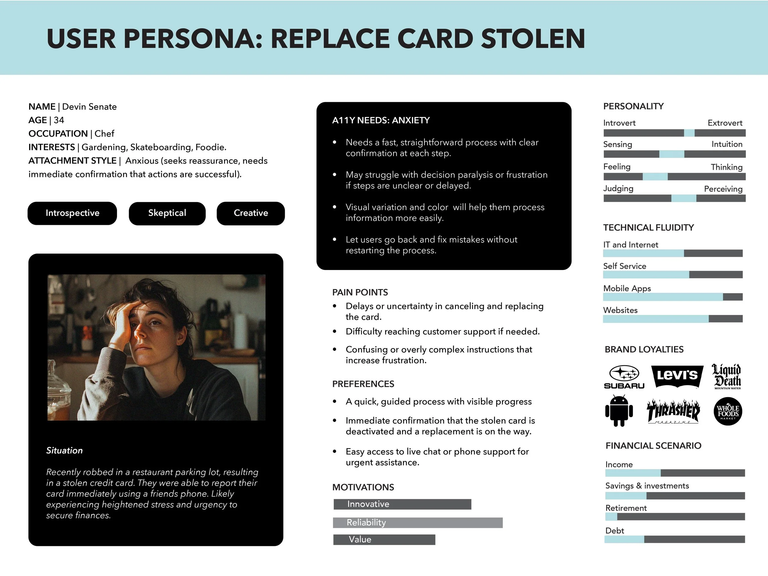
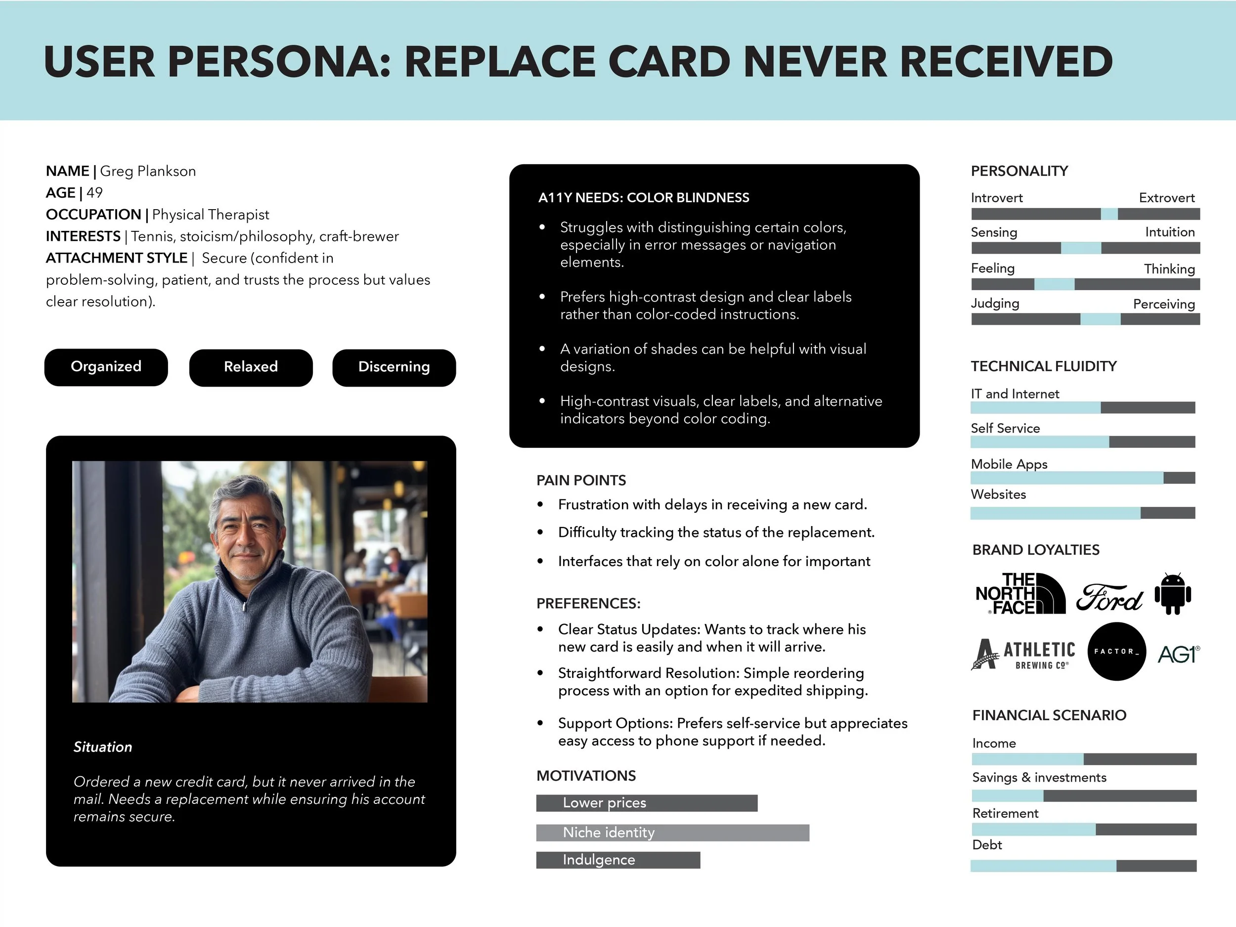
Anxiety creates temporary accessibility needs—affecting vision, reading comprehension, and decision-making for all users in high-stress moments.
The Solution
When your card is stolen, the last thing you need is confusion.
This redesign stripped away friction and added clarity—making a crisis moment manageable.
The Impact
Contributed to 1.8 → 4.8 star app rating (122K users)
Card art across 1,300+ companies - set new white-label standard
$25 saved per unnecessary card through optimized damaged card logic
Fewer support calls - users could actually help themselves
Trauma-informed design for high-stress moments
Prototyping
A walkthrough of the Replace Damaged Card prototype, one of the platform's higher-traffic support journeys. I prototyped the full flow in Figma and recorded it here running end to end, so the interaction, states, and transitions could be validated before development.
Research & Discovery
Research Process
User interviews about card loss/theft experiences
Psychological research on stress, anxiety, and cognitive function
Accessibility standards for dyslexia, mental health conditions, and age-related needs
Critical Finding
Users in acute stress experience temporary cognitive impairments:
Reduced reading comprehension and visual clarity
Impaired decision-making
Heightened need for clear navigation and reassurance
1 in 5 users already manage mental health or dyslexia challenges—fraud anxiety compounds these needs exponentially.
The Flow
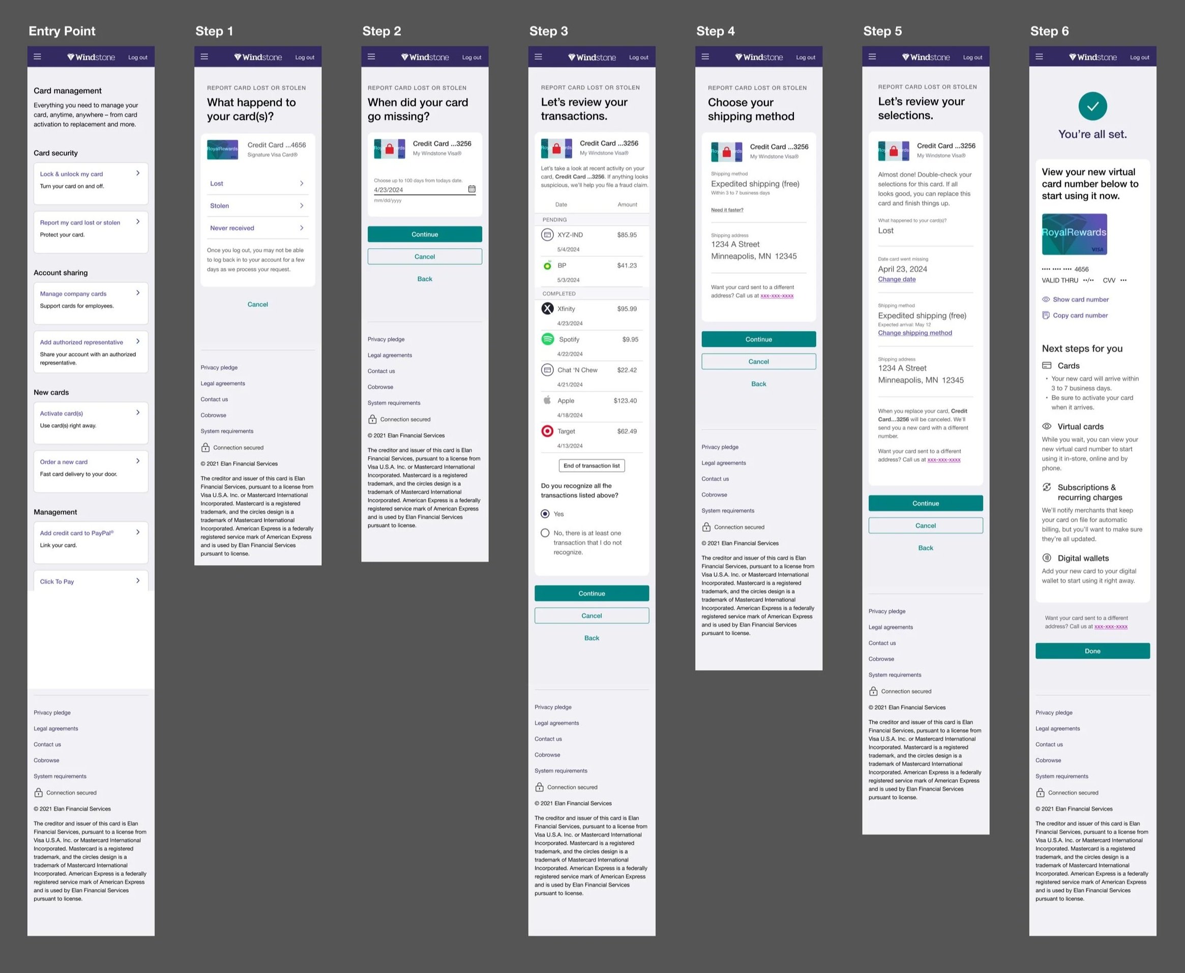
The flow was already slated to ship when I joined the effort. As the sole designer for Partner Card, I worked with two designers on the US Bank team, championing my platform's specific needs while contributing improvements that were adopted across both experiences. Every detail was designed to reduce anxiety and guide users with clarity and care.
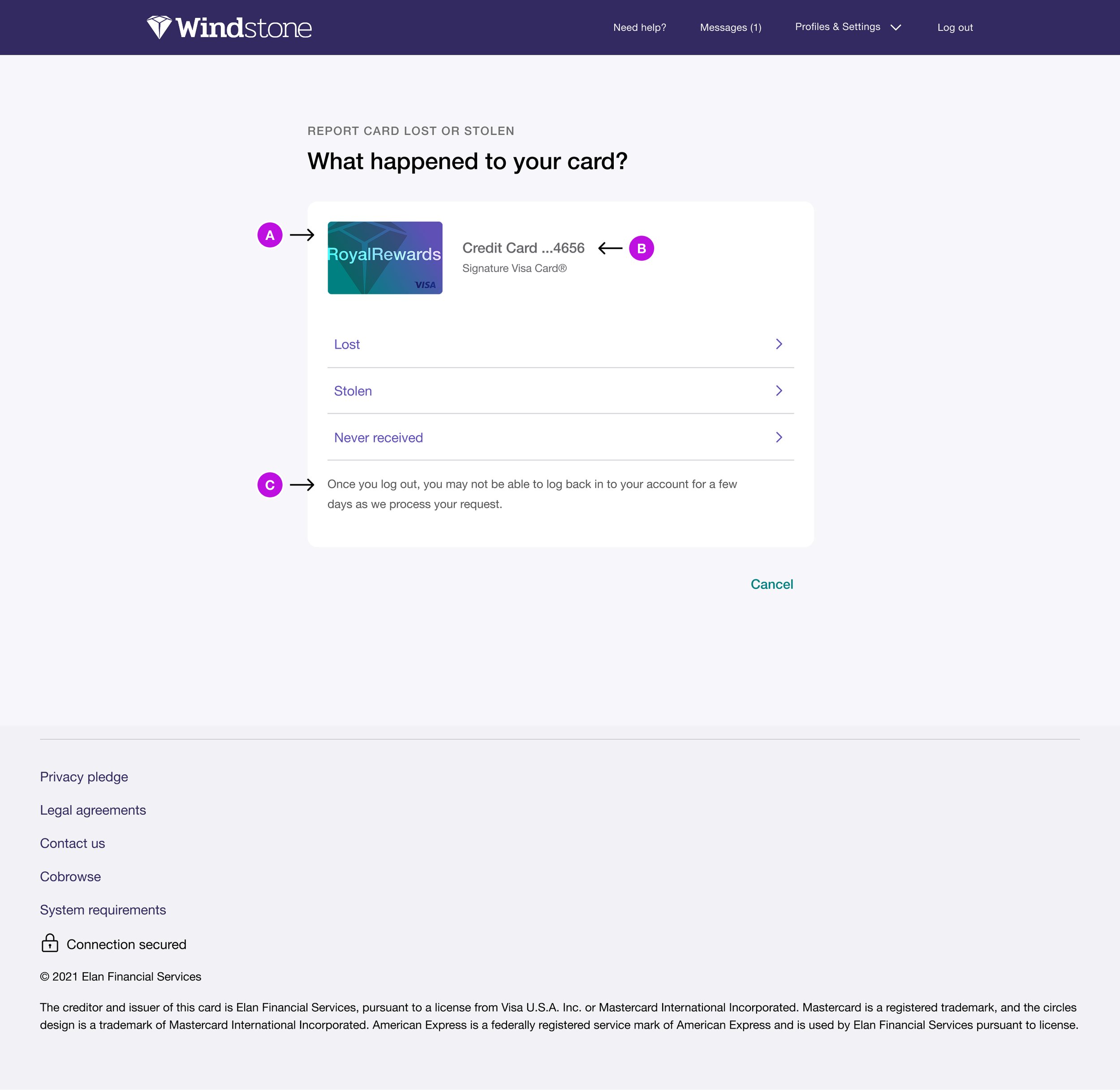
A. Card art for 1,300+ partner institutions
Visual anchor for stressed users to quickly identify their card
Transformed white-label platform from generic to branded
Adopted program-wide across Elan experience
B. Increased account number text size
Improved readability for visually impaired users and those experiencing anxiety-related vision impairment
C. Upfront security notice
Warned users about temporary account access limitations due to fraud protection
Allowed informed decision-making based on urgency and available time
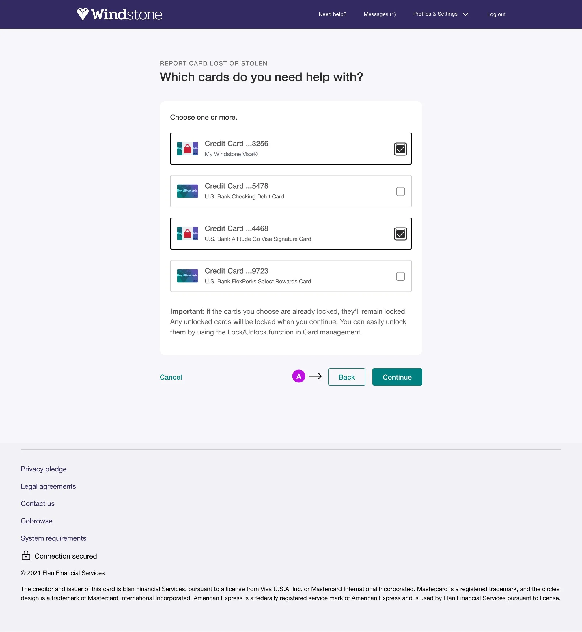
A. Added "Back" button throughout flow
Reduces anxiety by allowing users to review previous decisions without restarting
Critical accessibility feature for users experiencing decision paralysis or needing to double-check information
Empowers users to move at their own pace during high-stress moments
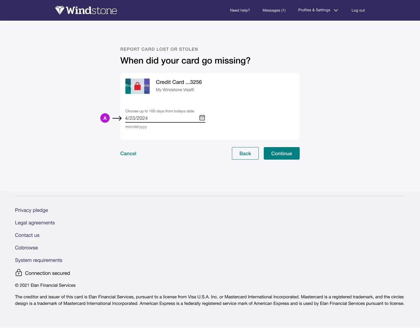
A. Dynamic transaction review period
Users only review transactions from the date they reported + 10 days for security
Creates a clear, manageable endpoint instead of overwhelming users with unnecessary data
If card went missing 3 days ago = 13 days of transactions to review (not 100)
Reduces cognitive load and anxiety by showing "End of transaction list"
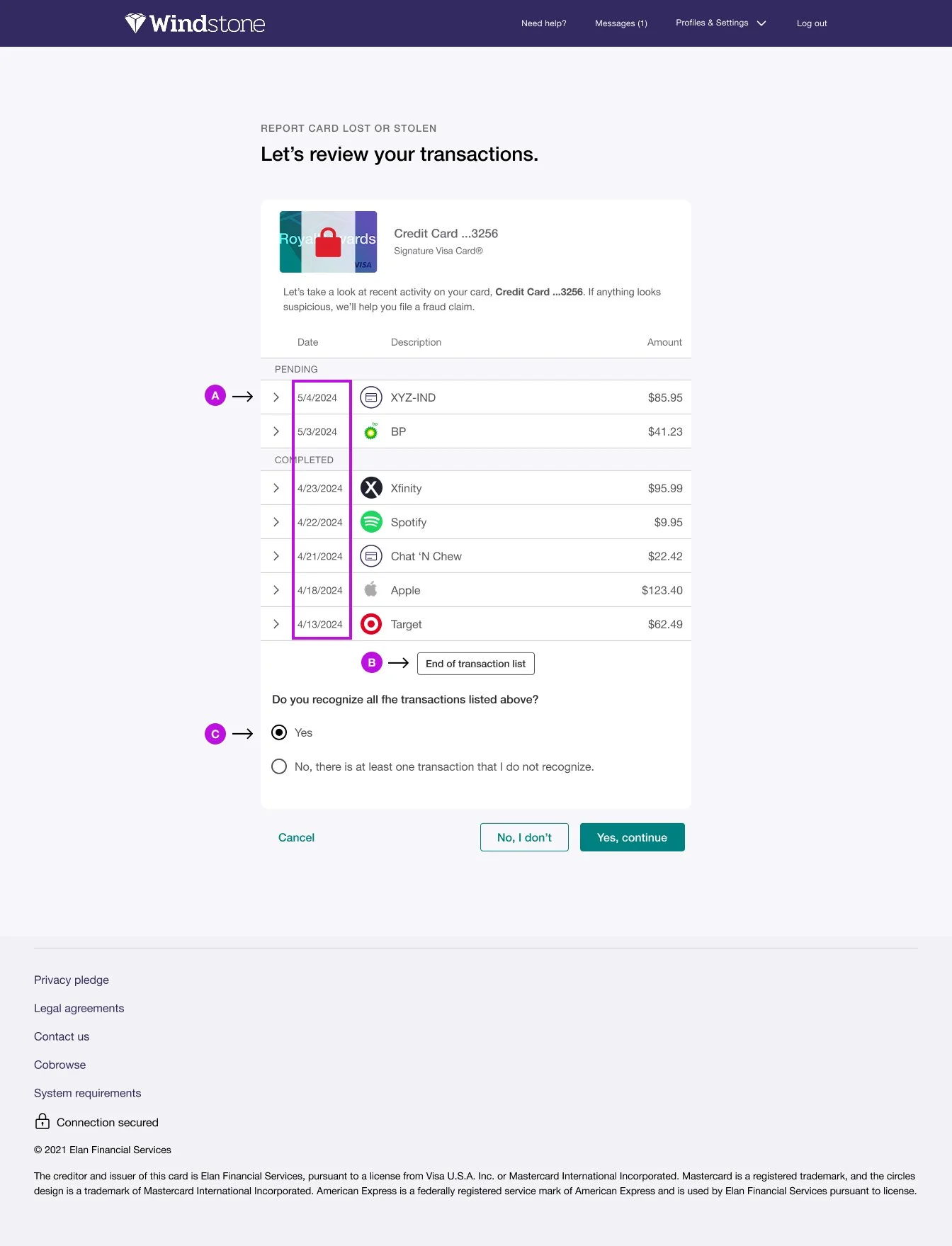
A. Chronological transaction display
Shows transactions from most recent back to reported missing date + 10 days
Reverse chronological order helps users quickly identify unfamiliar charges
Limited scope prevents overwhelming anxious users with unnecessary data
B. "End of transaction list" confirmation
Clear visual indicator that review is complete
Eliminates uncertainty about whether to keep scrolling
Provides closure before making final decision
C. Required radio button confirmation
Forces intentional decision rather than allowing users to skip review
Protects avoidant users from rushing through fraud check
Extra security step saves users from missing fraudulent charges
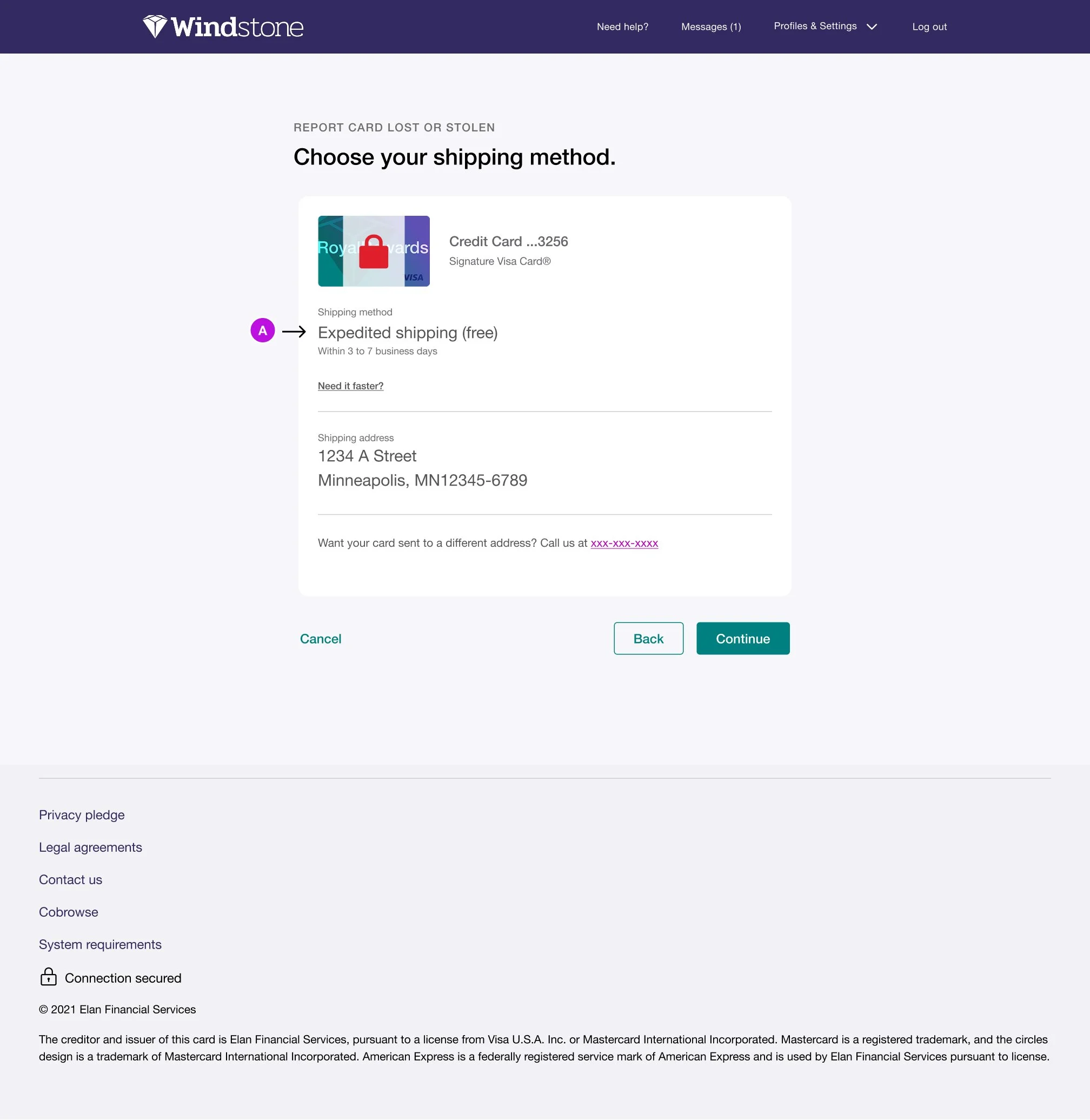
A. Expedited shipping as default (free)
Championed faster delivery to reduce user stress and financial disruption
Users regain access to funds within 3-7 business days instead of 10-14 days
Win-win: customers get relief faster, companies restore spending capability sooner
Eliminated decision fatigue by making the best option the default
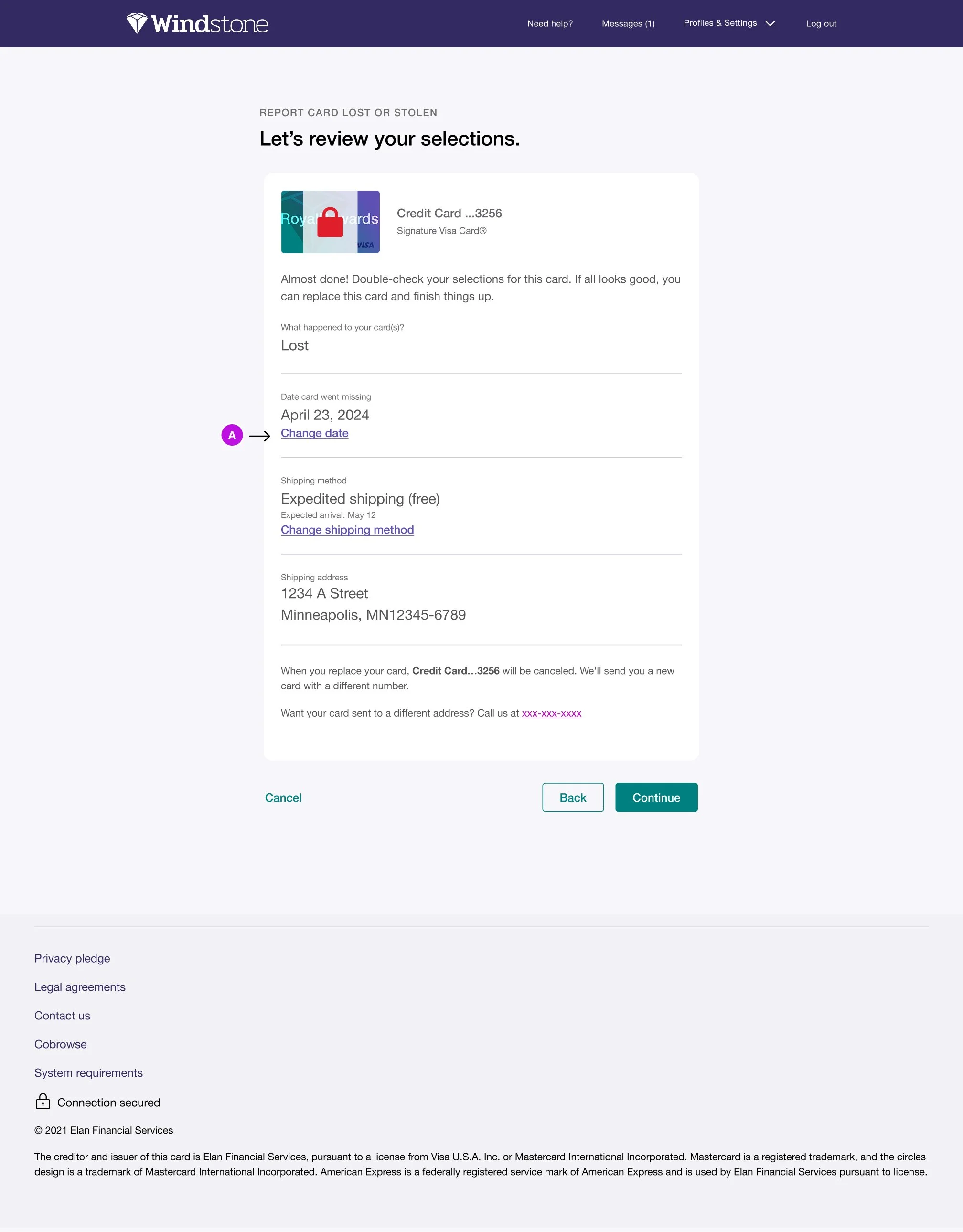
A. Prominent "Change" links for each selection
Allows users to jump directly to specific steps without clicking Back repeatedly
Reduces friction and navigation fatigue in multi-step flow
Empowers users to correct errors before finalizing
Prevents anxiety about being "locked in" at final review stage
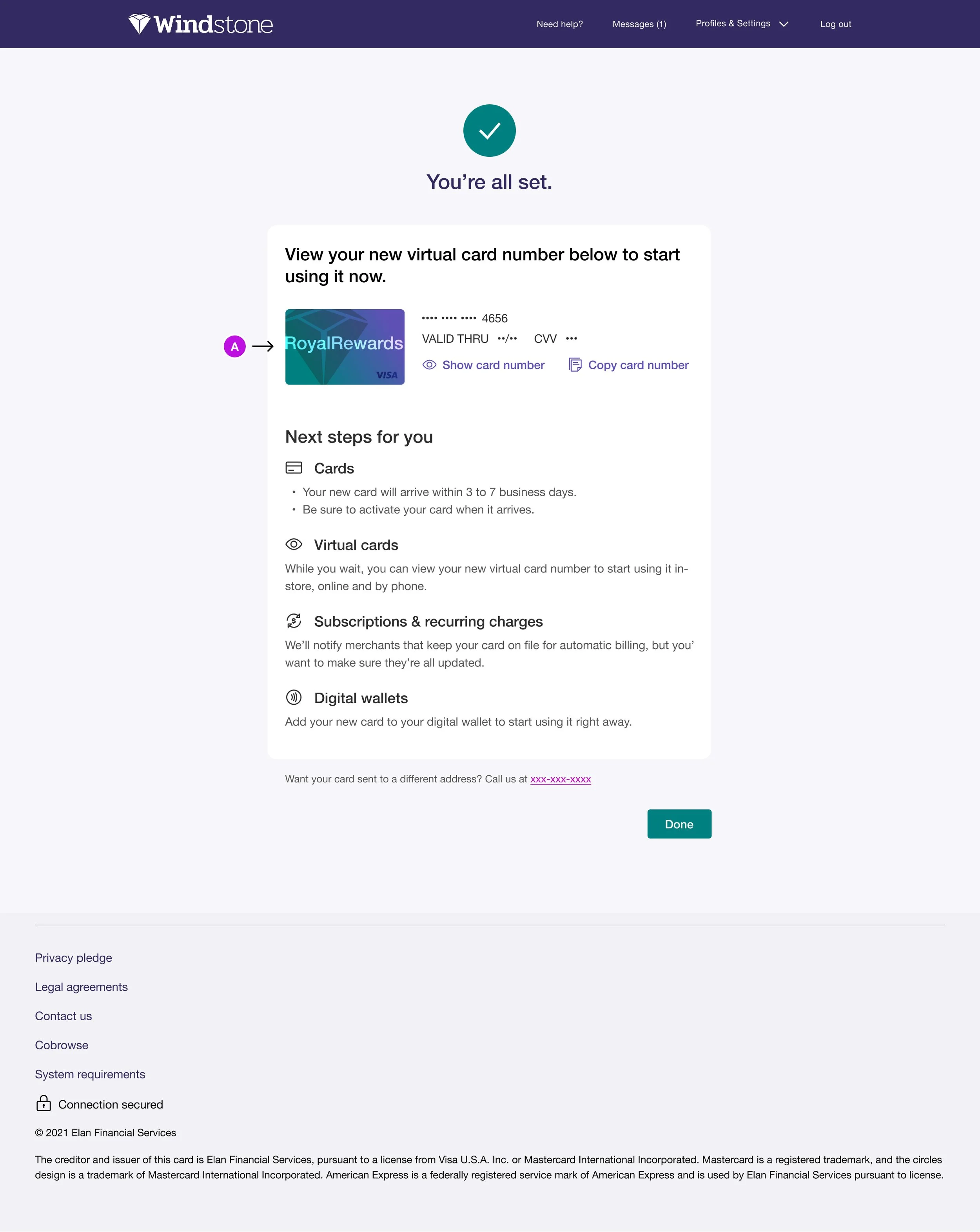
A. Moved virtual card number off card art
Ensures WCAG contrast compliance across all 1,300+ partner card designs
Card numbers now display on white background instead of variable card art
Eliminates accessibility barrier for users with low vision or color blindness
Allows partners to maintain brand identity without compromising readability
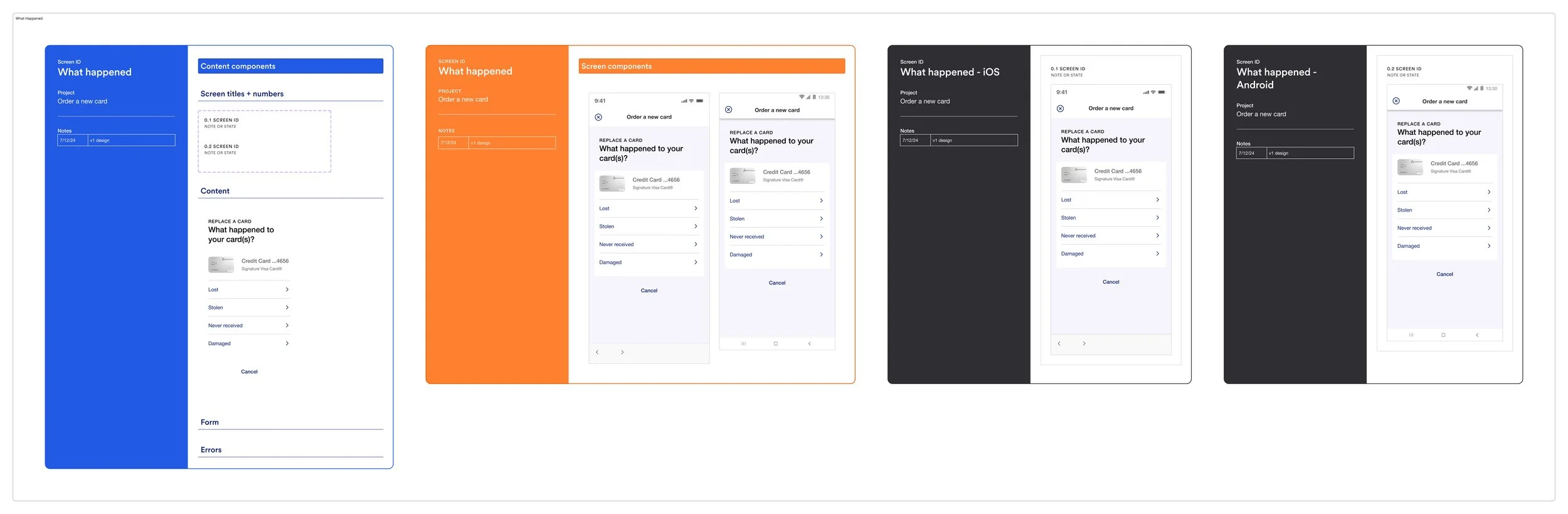
Production For Mobile App
This is where the build came together in Figma. I created component instances so screens could be updated continuously in an agile environment, limiting friction between design and development and saving production time as requirements evolved.
Outcome
Users completed the flow without confusion or errors in testing. Once shipped, the redesign gave the Partner Card platform its first self-service card replacement path, and customer service reported that members were actively engaging with the new feature, a capability the platform had never offered before.
Future Enhancements
This redesign significantly improved the experience, and during the build I advocated for two further enhancements. Both were approved but weren't ready in time for production, so they remain the clear next steps:
Progress indicator: A visual progress bar to help users understand where they are in the six-step flow and set time expectations during an already stressful moment.
Live support integration: An in-flow chat widget offering real-time assistance for users who need clarification, so they can get help without abandoning the process.