Schafer Speciality
Branding Campaign.
Schafer Specialty is a talented landscape design company, but in 17 years it never built a brand—so its true expertise stayed hidden from potential customers, costing real opportunity.
Discovery & Process.
I started by spending time learning who Schafer Specialty Landscape & Design is, what makes them different, and where their online presence was falling short. What followed was groundwork: the interview with Melissa, a look at the competition, and the opportunity it pointed to.
-
Melissa Schafer has designed and built landscapes on Vashon Island for seventeen years. She is a Certified Professional Horticulturist, an APLD member, and a Vashon Chamber of Commerce board member. With her husband Nathan, she runs a firm that handles the full project, from her design vision to his construction craft.
What mattered most to Melissa was permanence. She designs landscapes meant to mature over decades, built to last a lifetime, and she wanted the site to carry that same stability and professionalism. The conversation revealed a business that had outgrown its website. The credentials were real, her roots in the community ran deep, the work itself was stunning, and none of it came through online.
-
Before proposing a direction, I looked at how other landscape firms present themselves online. I studied seven design-build and landscape architecture sites known for strong web presence, from regional firms to nationally recognized studios, and pulled apart what made them work: how they structured their portfolios, told project stories, handled photography, and built trust with prospective clients.
The goal wasn't to copy anyone. It was to understand the standard Schafer would be measured against, and to find the specific choices that would let a small island firm hold its own next to much larger practices. That research shaped the site architecture, the case study format, and the photography brief that followed.
-
The research pointed to a clear opening. No competitor combined design credibility, full island capability, and a strong website. Schafer already had the first two. The opportunity was to close the gap online and let the work speak for itself.
Defining the Emphasis.
Four Style Guides.
-
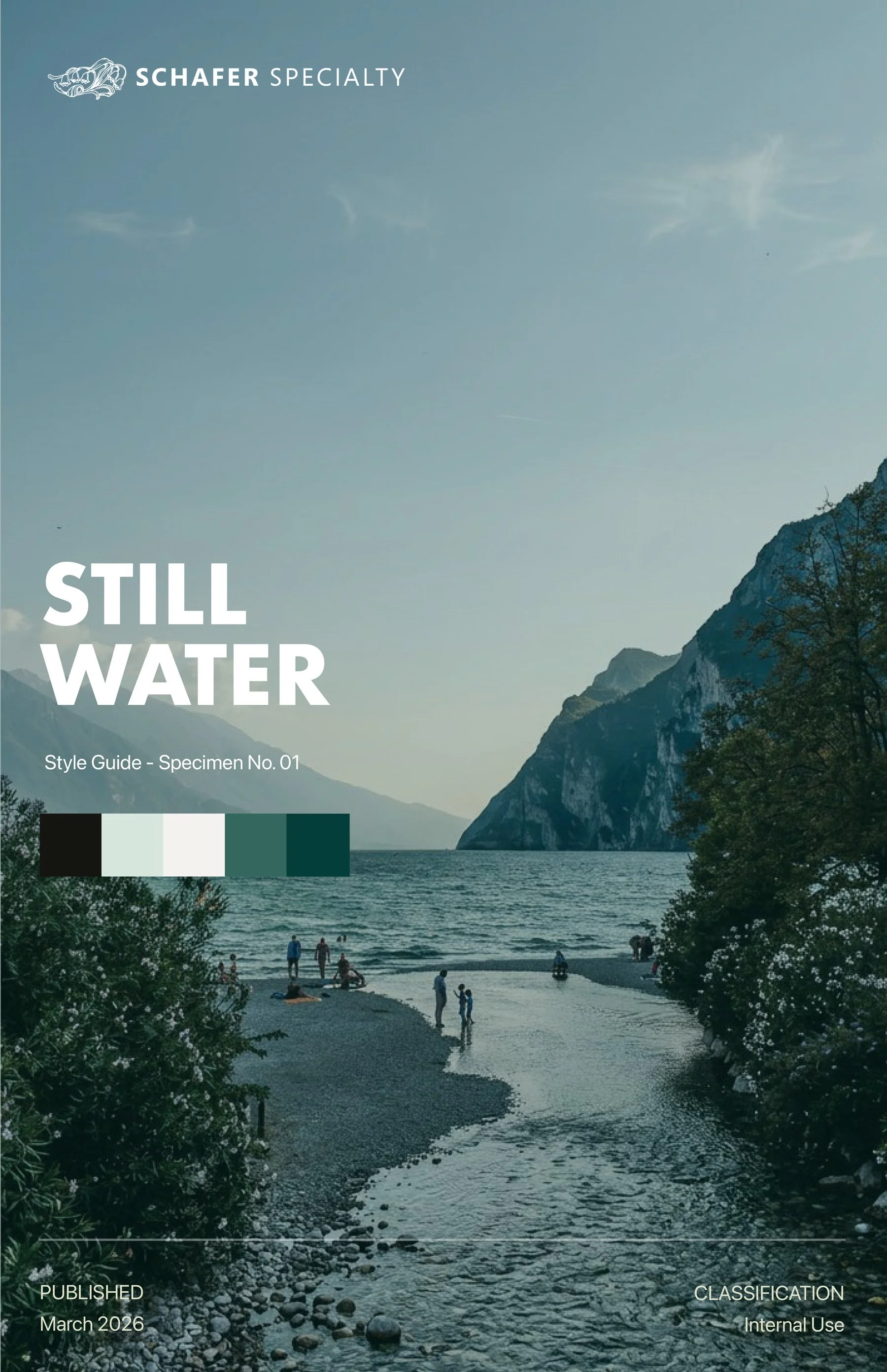
This direction is for a practice that understands restraint as a form of richness. Still Water draws from the natural world without mimicking it, finding the considered line between what is placed and what belongs. It is classical without being formal, refined without being cold. A brand for a firm whose work endures quietly, whose clients return, and whose landscapes are still beautiful twenty years after the first stone was laid.
-
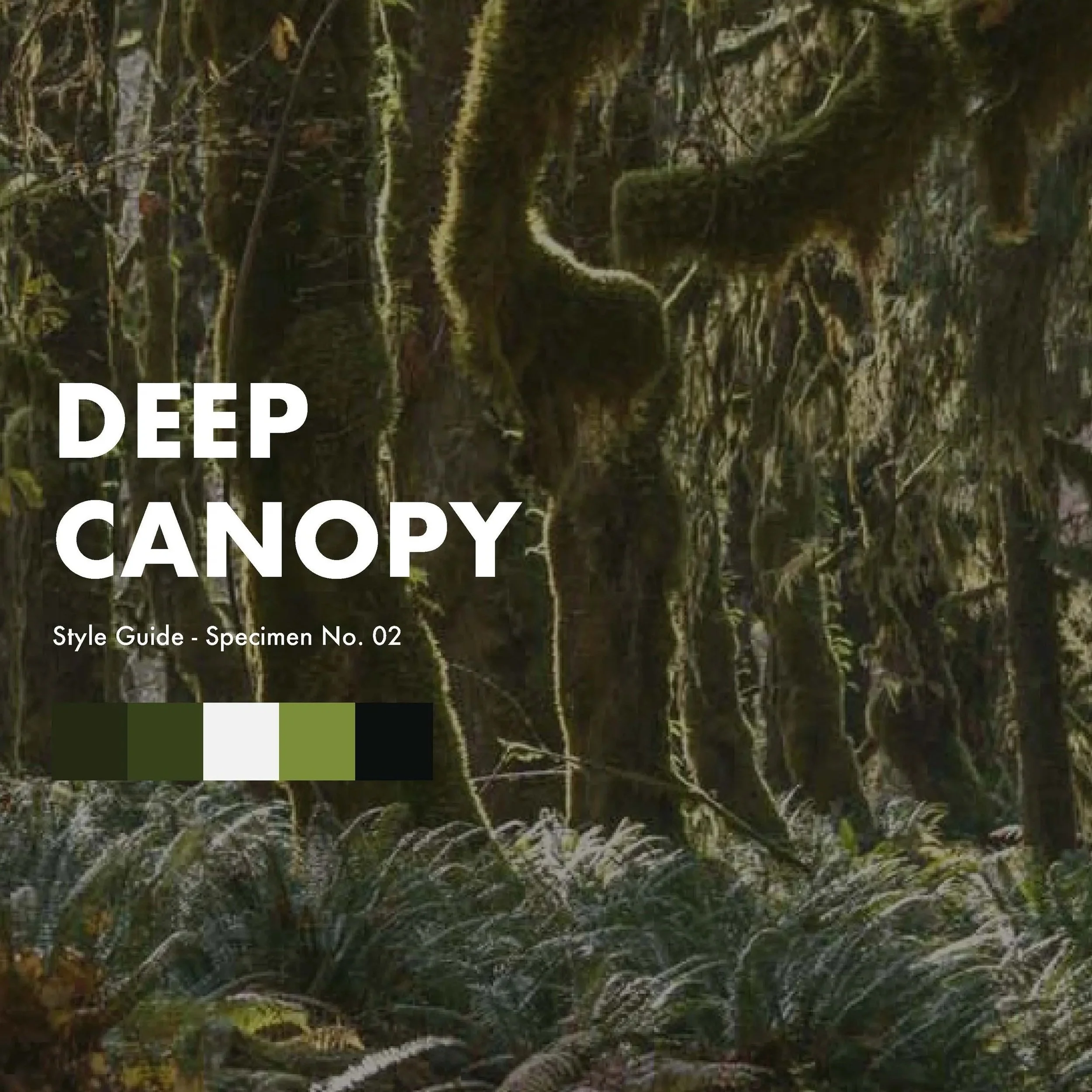
This direction is for a practice that goes all the way in. Deep Canopy is rooted in the physical reality of the Pacific Northwest, the weight of it, the density, the logic of a landscape that has been forming for centuries. It is bold without being aggressive, warm without being soft. A brand for a firm that does not impose on the land but works with what is already there, building things that take hold and deepen with every season.
-
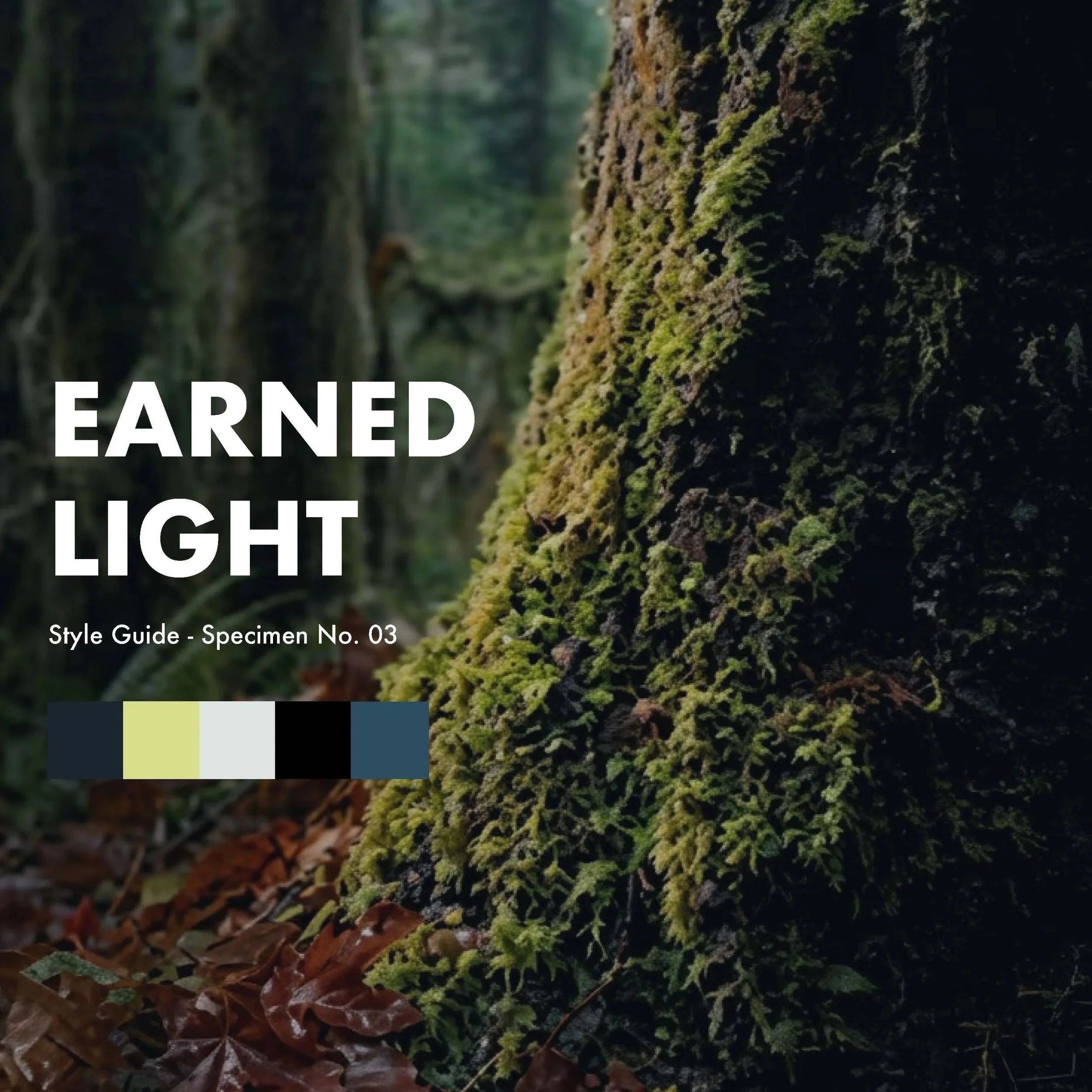
This direction is for a practice that understands the designed life. Earned Light is about the garden people actually live in, the path they walk every morning, the place they sit at the end of the day, the view that makes everything feel possible. It is refined and approachable in equal measure. A brand for a firm whose work is felt before it is seen, whose clients don’t always know why a space feels right, only that it does.
-
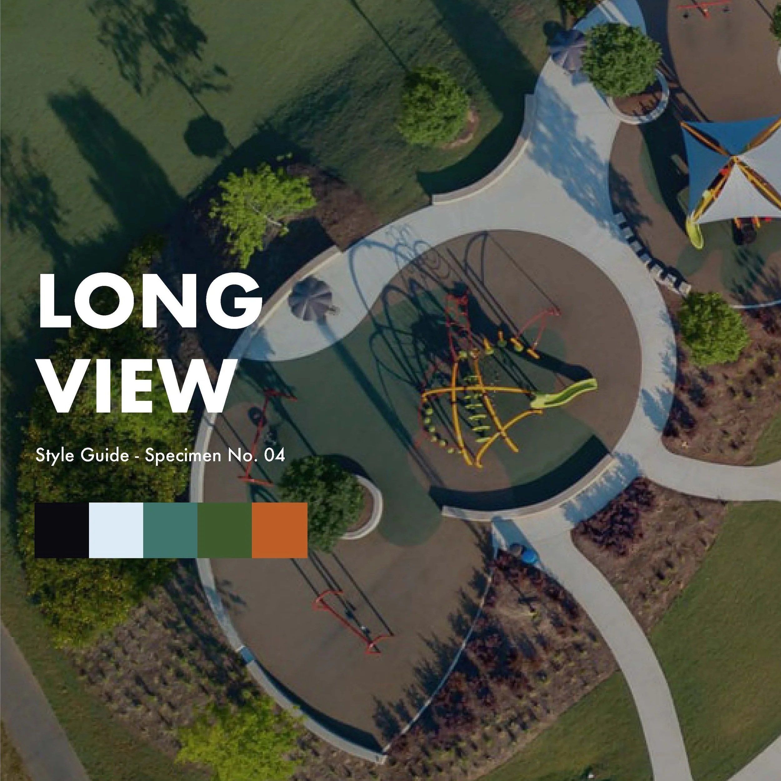
This direction is for a practice that thinks at scale. The Long View is confident, expansive, and built for the long game, for firms whose work outlasts the conversation that started it, whose projects become landmarks, whose vision extends well beyond the drawing. It is a brand with civic ambition and the authority to match. For a firm that doesn’t just design landscapes. It shapes how people experience place.
The Final Edit & Result.
Overview.
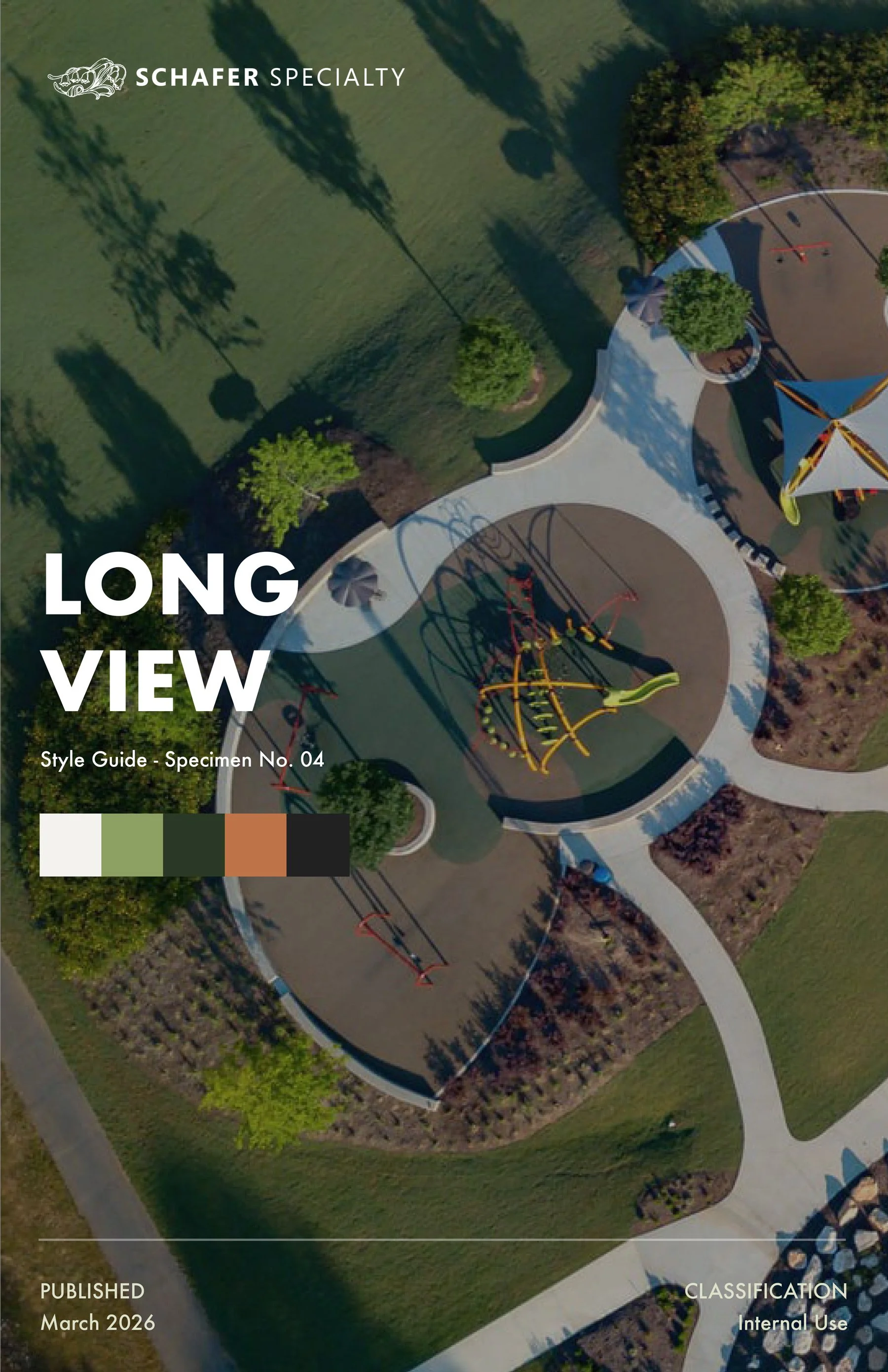
This direction is for a practice that thinks at scale. The Long View is confident, expansive, and built for the long game, for firms whose work outlasts the conversation that started it, whose projects become landmarks, whose vision extends well beyond the drawing. It is a brand with civic ambition and the authority to match. For a firm that doesn’t just design landscapes. It shapes how people experience place.
Voice & Tone.
TAGLINE
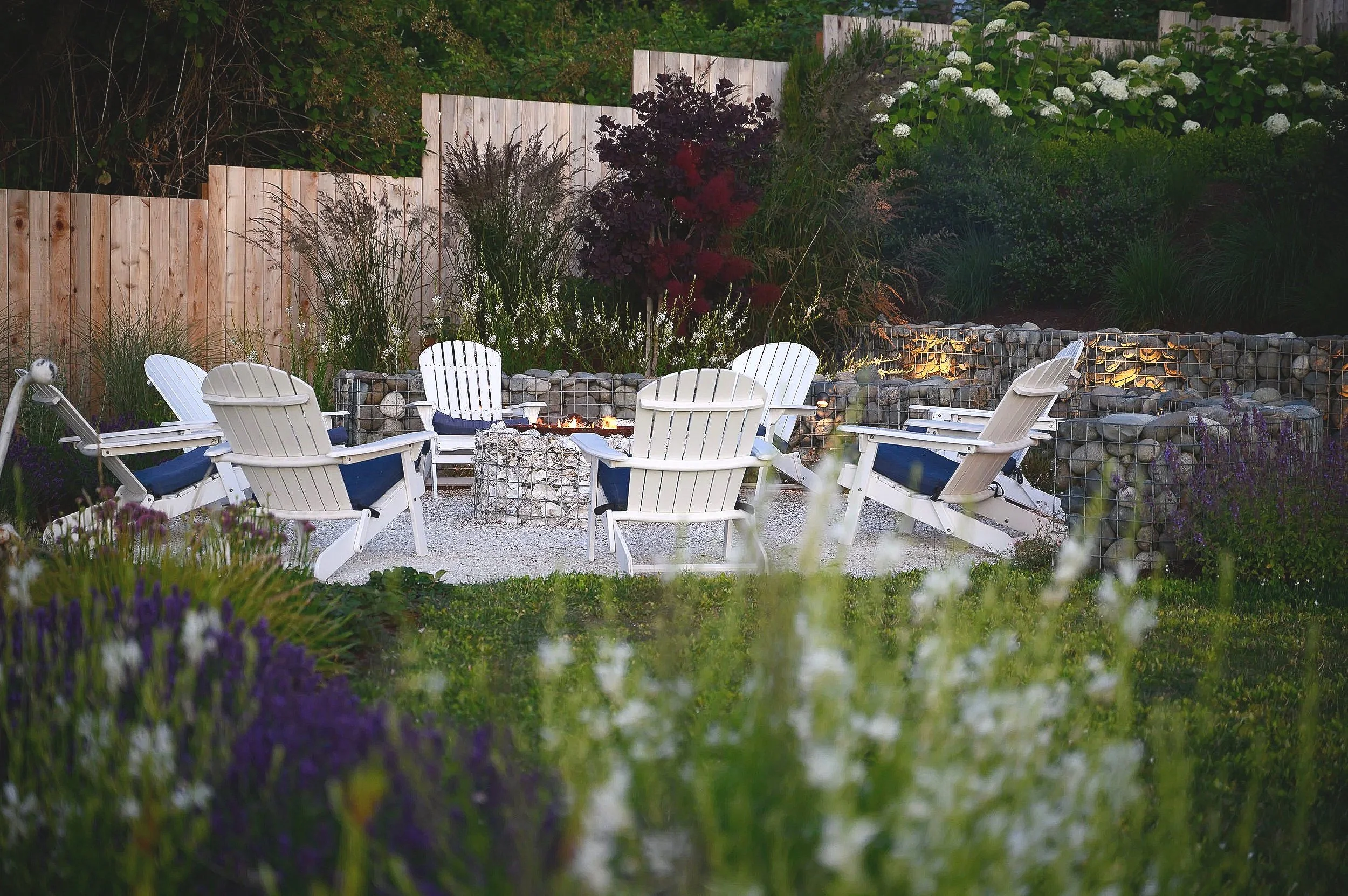
Drawn from the earth. Built to remain.
INSPIRED BY: Mary Oliver
You have always known that the earth is generous to those who
pay attention. That a well-placed stone, a considered threshold,
a view held open by a careful hand. These are not small things.
They are the whole thing. You move through the world like that.
Noticing. Tending. Making room for what wants to grow. The land
shaped by the lives it holds. That has always been enough. That
has always been everything.
BRAND WORDS
Bold. Playful. Timeless.
SONG INSPIRATION
Northern Sky — Nick Drake
Illustrations
& Style Guide.
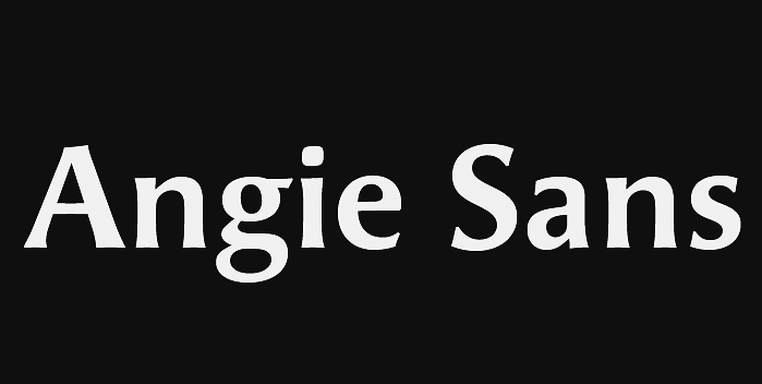
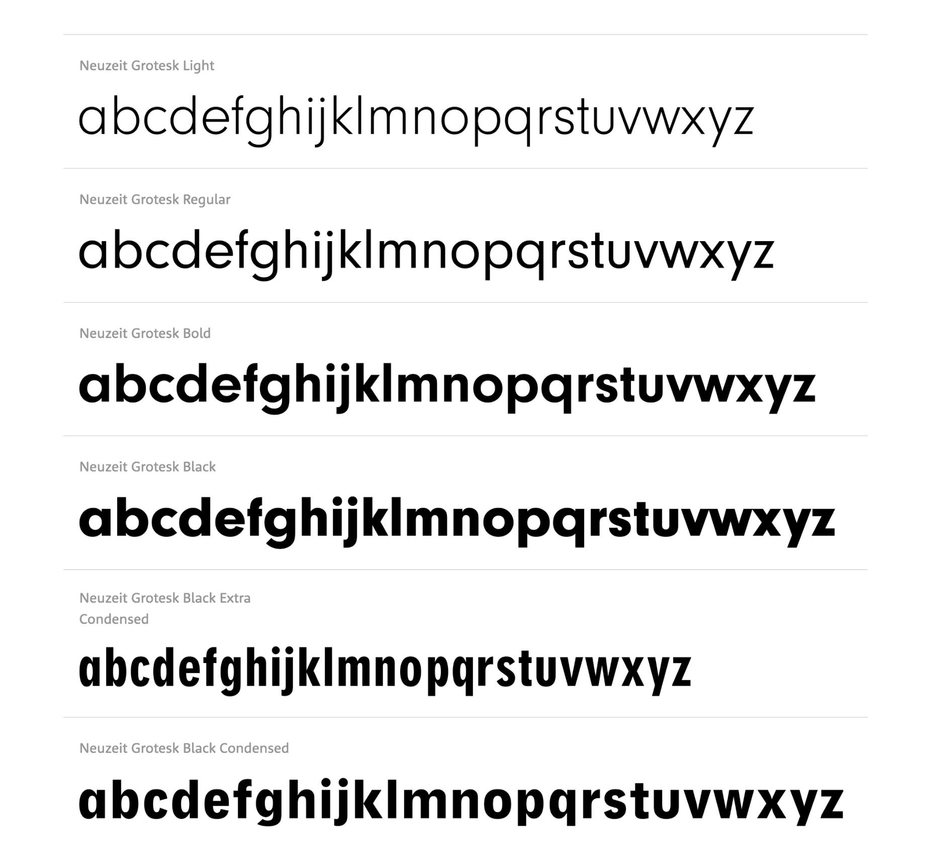
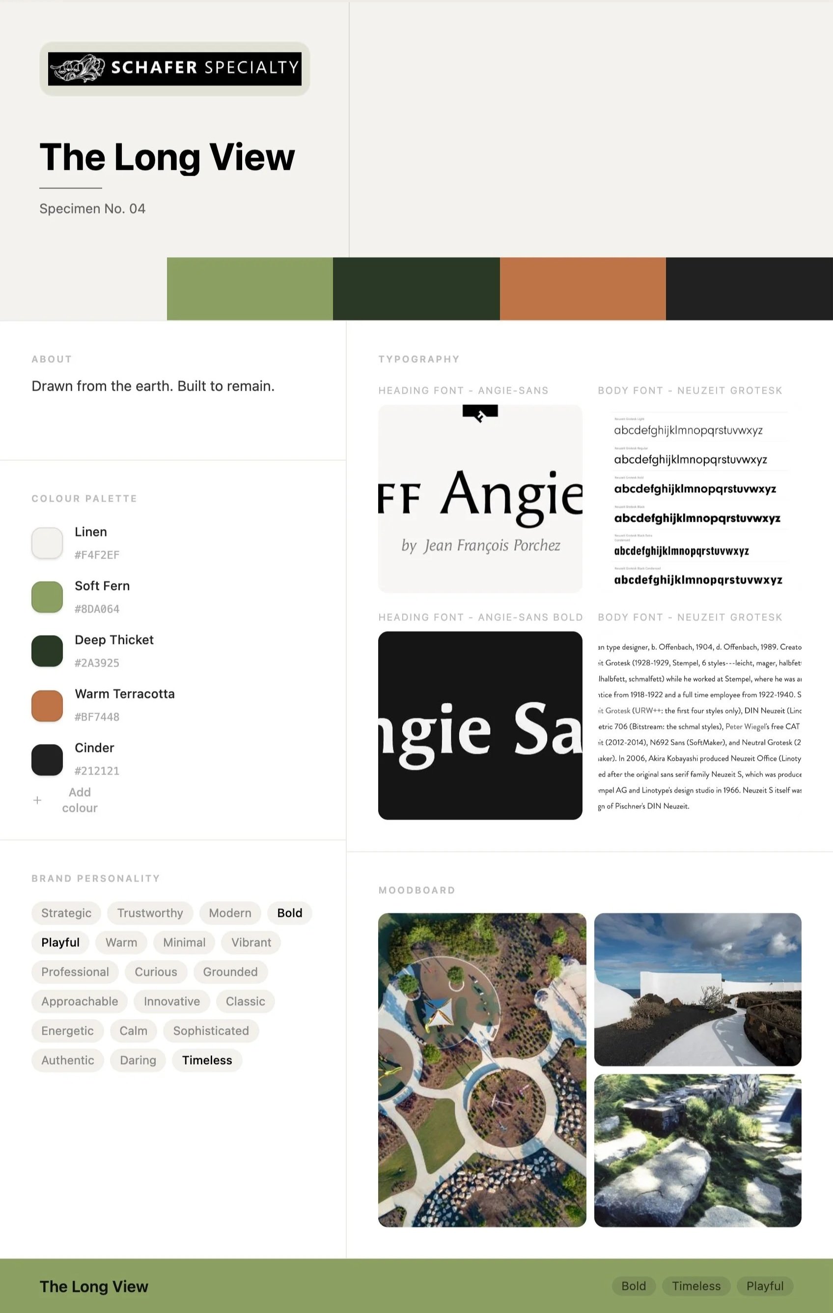
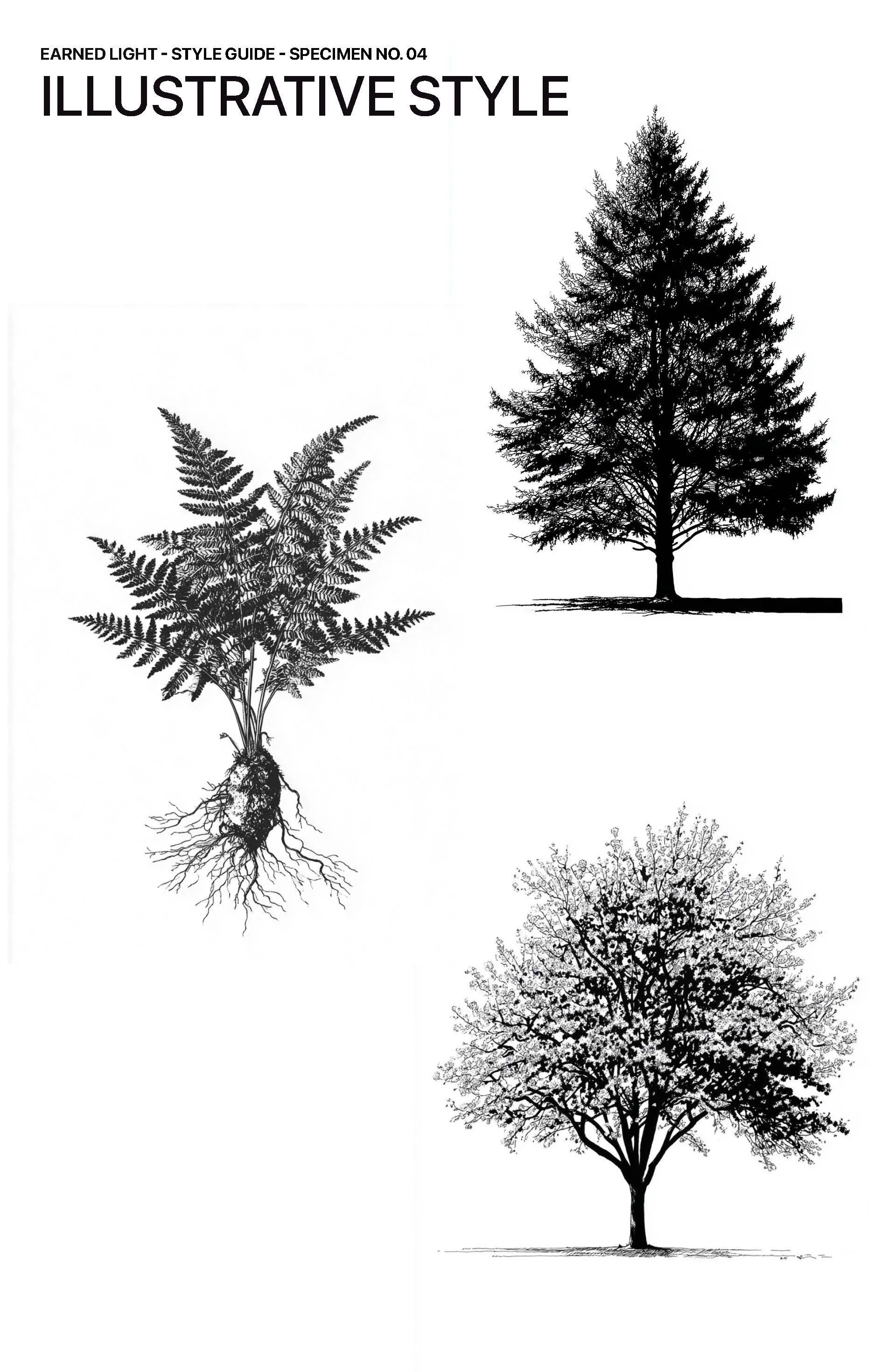
The visual identity pairs precision with personality. The custom illustrations are architectural and striking, rendered with a level of accuracy that reflects the craft of the work itself. Typography anchors the system: FF Angie sets the headlines with character, while Neuzeit Grotesk carries the body copy in a clean, readable voice. Together they give the brand a personality that is bold and timeless, with a touch of playfulness.

Linen
#f4f2ef
The color palette came together through close collaboration with Melissa. The greens were chosen deliberately to reflect the species of trees she uses most in her designs, grounding the brand in the real material of her work. They also needed a subtle range of warm and cool shades, so Soft Fern (#8da064) and Deep Thicket (#2a3925) could sit alongside the greens in the photography rather than compete with them. Because Melissa dislikes reds, the challenge was finding a warm, contrasting color for calls to action that still felt stable and considered. Warm Terracotta (#bf7448) was the natural answer, drawing the eye without disrupting the calm. Warm neutrals rounded out the system, with Linen (#f4f2ef) adding nuance and a personal touch in place of a cold, clinical white, and Cinder (#212121) grounding the palette in a soft, deep near-black. As a final step, each color was named to live inside her brand, keeping the concept consistent from our earliest conversations through to the finished guide.

Soft Fern
#8da064
Color Palette.

Deep Thicket
#2a3925

Warm Terracotta
#bf7448

Cinder
#212121
Mood Board.
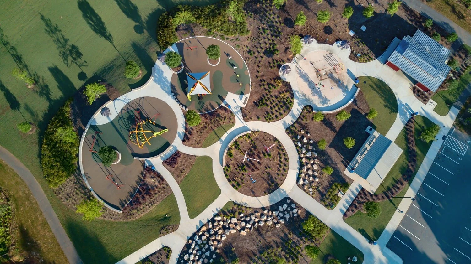
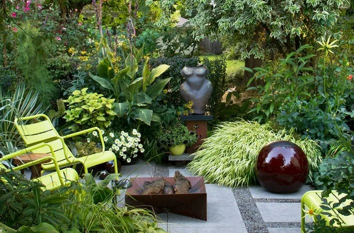
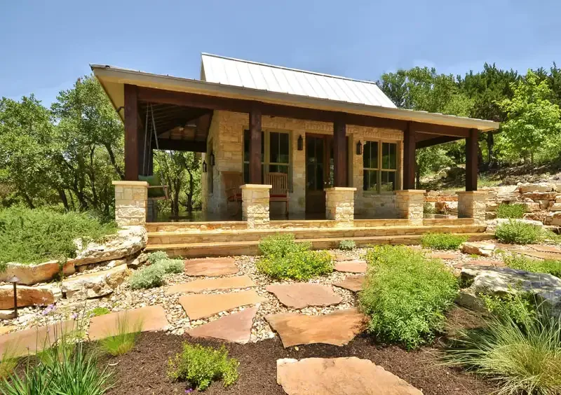
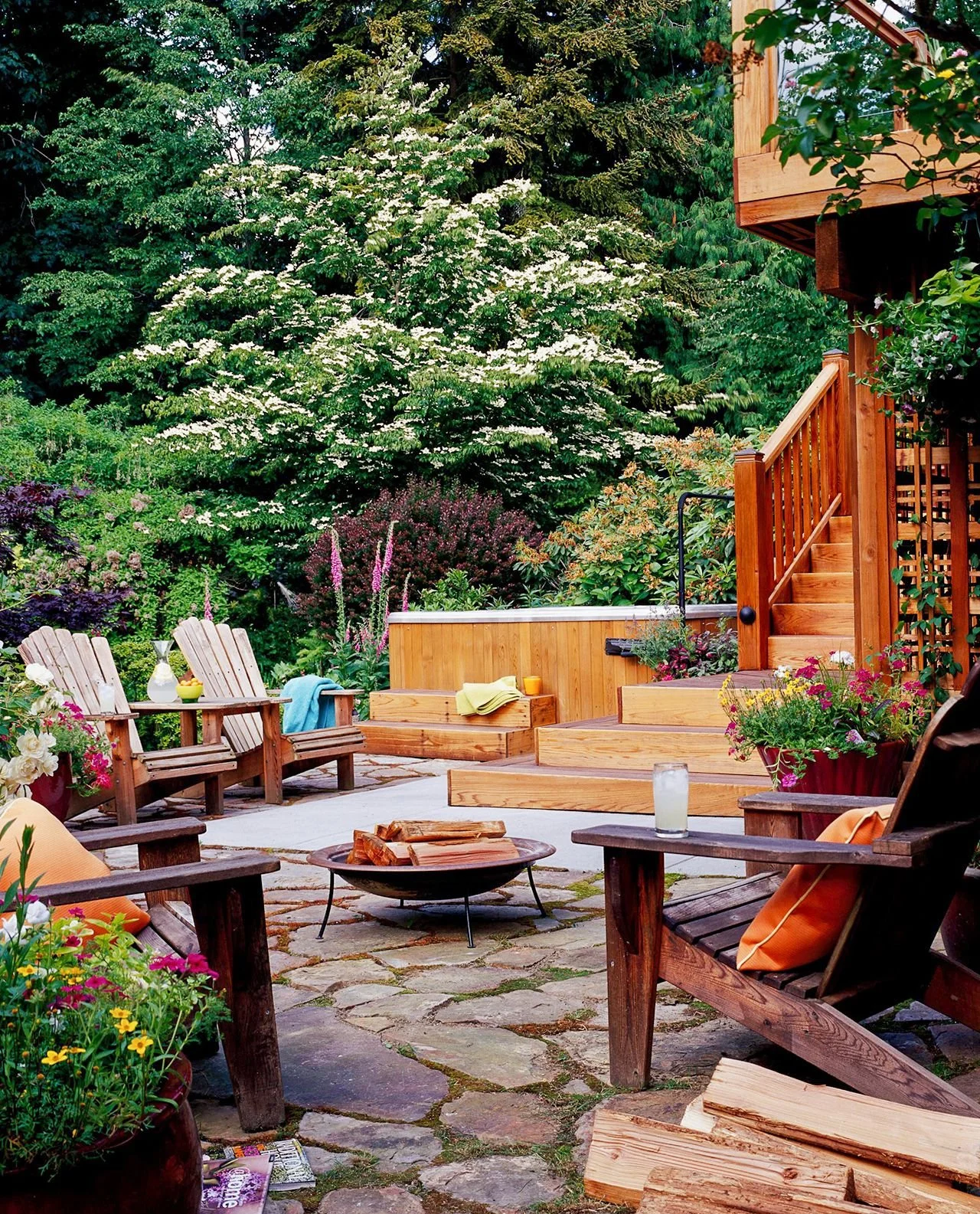
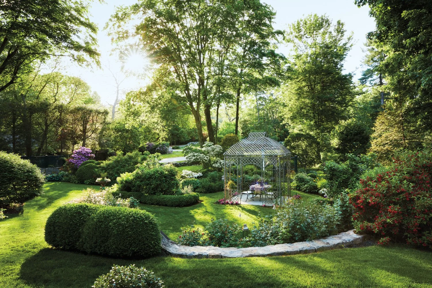
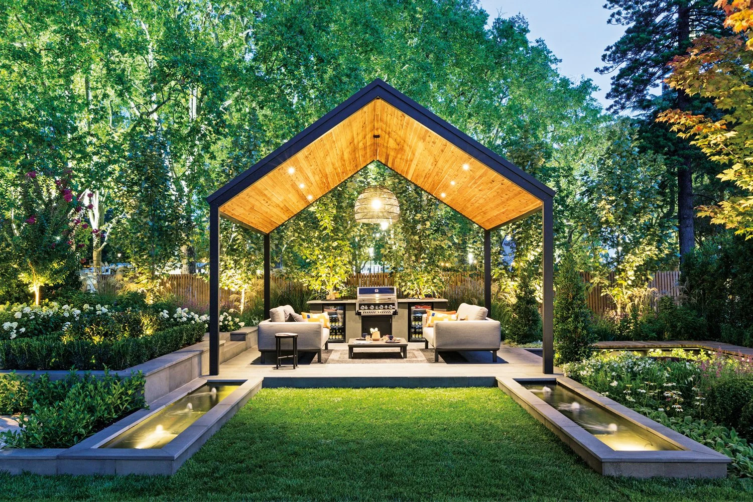
The mood board took a deliberately literal direction. Rather than working in abstractions, I mapped out how the real pieces would interplay: the art direction and style of the photography, the color palette, the typography, and Melissa's own design sketches, all in one place. Seeing them together made the relationships clear and set up the next step, which was art directing the photoshoot itself.